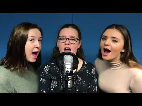
Here is our final music video;
Friday, 8 December 2017


Thursday, 30 November 2017
Magazine Advert draft 2 and feedback(Ellie Taylor)
Magazine Advert Draft 2
What to improve:
Consider fonts a little more
consider placement
Make the house smaller and put at the bottom of the magazine advert
What went well:
The use of the image
Having the main characters on the the advert
The dolls house linking towards the video and digipak

Feedback from target audience
- The advert does not link well with the video
- Photoshop is a little poor showing very little Photoshop skills. To improve maybe change the location and make it look more edited to resemble a magazine advert.
- Maybe add the younger character from the video to show the link
- Does not show the narrative that appears in the video
- Have brighter colours and make it stand out more
- Make sure that the genre is clear
With this feedback, we are now going to consider adding the younger versions of the band members to show the link between video and the magazine advert. By changing the location it may be clearer to the audience. from the feedback we are going to make sure that the writing stands out and portrays the genre to the audience. We will change the font and colours as from the feedback we noticed that the genre was not as clear as we would like.
Tuesday, 28 November 2017
Magazine Advert Draft 1 and Feedback(Jennifer Skeel)
Magazine Advert Draft 1 and Feedback
Positive feedback
- Good choice of background image
- Well done for including logo and iTunes logo
Improvements
- Pull Misterwives down
- Consider font and colour at the bottom of the advert
- Add reviews
- Maybe consider adding a dolls house to it?
Feedback from target audience
- The advert looks empty around the top, try to add in some ratings or reviews
- The happy portrayal of the artists is good and the background shows the pop genre
- Choice of location for main background picture is good
- White font looks basic and unattractive
- Name of the group and album could be a different font to help stand out more on the advert

We will take the feedback we have been given to alter our magazine advert so that it suits are artist image and attracts our target audience. We will do this by changing our colour of font and pulling Misterwives down so that we are portrayed correctly. We will also add an image of the doll's house at the bottom so that there is a link to our music video. This will make sure the audience have a better understanding of how our chosen song and artists link together. Plus, by responding to our audience feedback and changing the colour and style of font and adding more reviews we will be able to attract more of our target audience.
Digipak draft 2 and feedback(Gabrielle Chambers)
Here is our final digipack;

Digipack Feedback
- Are you sure this is the right photo for the front cover
- Make sure your text on the same products
- Swap the photo of the house and the photo with the dolls house and the girls
- Change the sizes of the spines.

Digipack Feedback
- Are you sure this is the right photo for the front cover
- Make sure your text on the same products
- Swap the photo of the house and the photo with the dolls house and the girls
- Change the sizes of the spines.
Saturday, 25 November 2017
Digipak Draft 1 and feedback (Ellie Taylor)
Digipak
To improve:
Too much leaf
Take leaves away from track listing
Add dolls house?
Maintain a house style- keep the same font on both magazine
advert and digipak
What went well:
The location for the shots
The link between the music video and the magazine advert
The colour for the front cover titles

Audience feedback:
Make sure that the colours blend well
Change the font and colour
Have a change in locations
There is too much leaf and nature
Maybe add some rollerskating or shed
From the audience we are going to consider changing the font and colour of the track list and the front cover. Also having a wider range of locations.From this feedback, we are going to consider using a wider variety of locations and adding the younger children in a couple sections to make sure that the digipak links with the music video and the magazine advert. We will also add a dolls house and change the font to match the magazine advert.
Subscribe to:
Comments (Atom)
-
Casting/Audition information First of all, we wanted to look into our target audience, because we will need people in our target audience...
-
 Lighting notes In our music video, we will use naturalistic lighting because the majority of our video will be filmed in outside locati...
 -
Plot/Narrative The plot/narrative for the music video is about the growth of friendship and how they stay friends throughout their child...